Chatbot Template
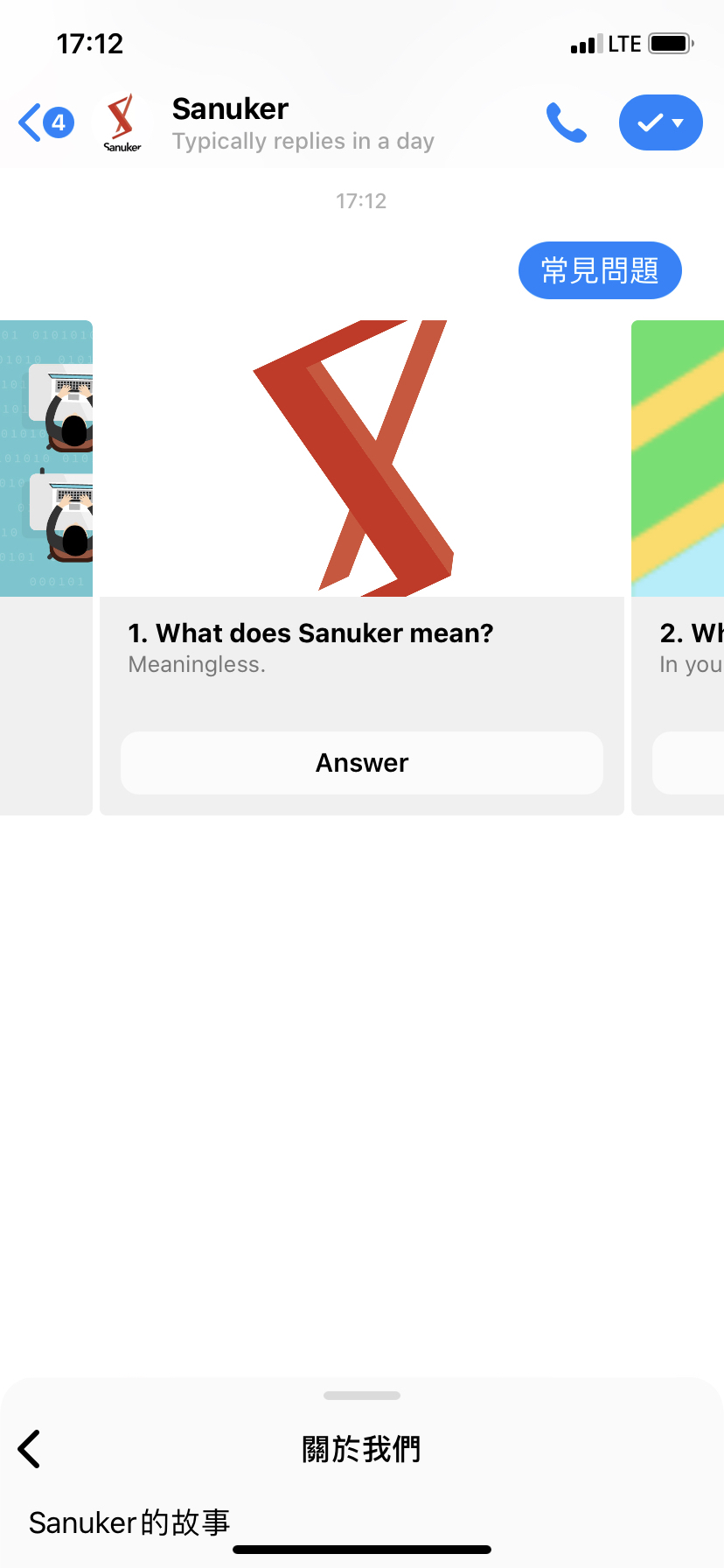
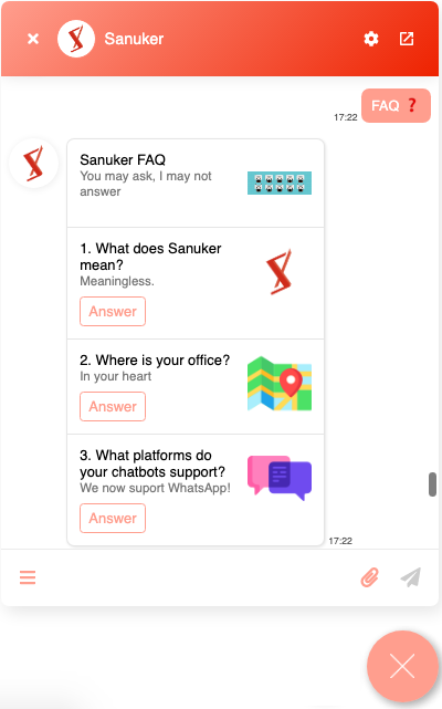
FAQ
Surely we all want our chatbot to perfectly answer every question that is raised by our customers. However, integrating natural language processing and training up a chatbot with intelligence may just be too much of an effort (in terms of both time and cost) at an early stage...
In the light of such consideration, we create a simple template for you to display your own list of frequently-asked questions (FAQ).
The FAQ template can be presented in a vertical list view or a horizontal carousel view with questions and answer buttons. When users click on the buttons, they would be able to receive the answers correspondingly. All you need to edit is the questions, answers and side images.
A FAQ list or carousel help your users quickly find the answers they are looking for and avoids manual effort to handle repeated questions.
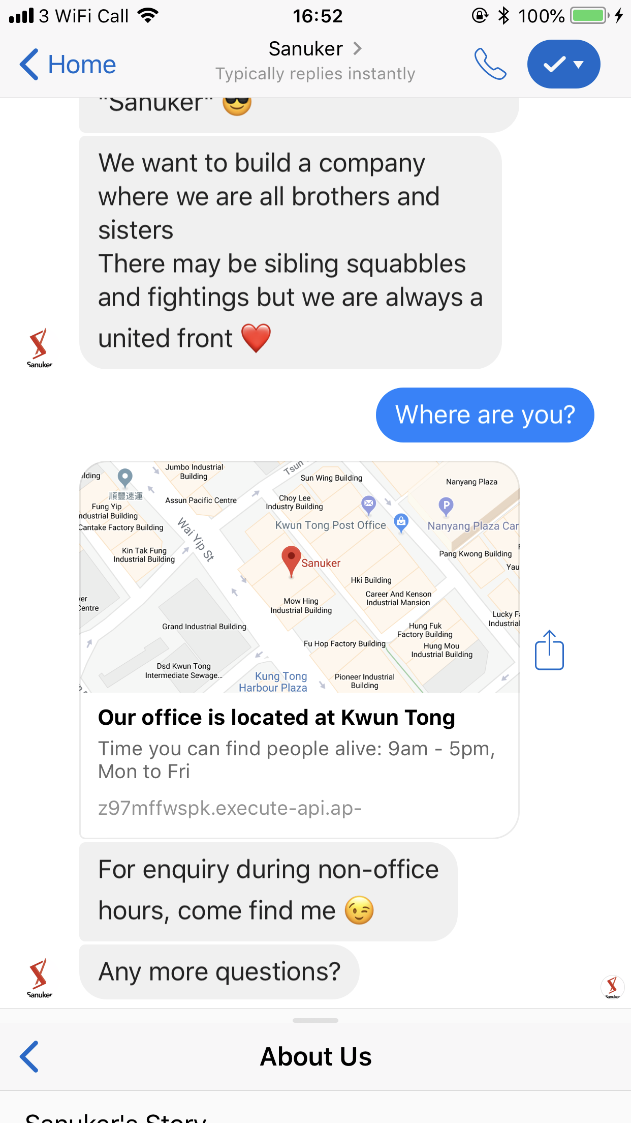
Map
There're quite many scenarios you may need to show directions to your users: shop location, office address, kiosk location...and we think a map definitely gives a way clearer illustration than an address in text (your users will copy and paste it back to Google Maps anyway, so why bother?)
The map template consists of a preview image of the map and an address in text. When users click on the preview image, they would be able to open an in-bot browser that directs to Google Maps and show real-time directions to the destination.
Tips:
- You could put your opening hours in the subtitle section
- You could even add a button right under the title section to enable users to click to view the map
A map template helps show real-time directions of specific location to your users without them leaving the chatbot
Photo Carousel
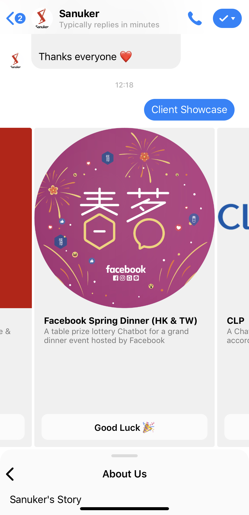
The use of multi-media content (i.e. image, audio and video) helps make your chatbot conversation more abundant and interactive. Sometimes you may want to show your users more than just one photo but sending them out all at once would very likely look annoying and spammy.
Therefore, instead of bombing your users with a flood of images, let's create a carousel of photos so that they can browse through comfortably.
A Carousel usually consists of an image, a text description and a button for call-to-action. Just take away the button. You can just include an image and a text caption in your carousel without a button and then you will have a perfect photo album carousel. You could show to 10 photos for each carousel.
Tips:
- Subtitle is not a must so you could leave it to create a shorter caption
- Remember to add another response after the carousel if you still want to guide your users to the next step
A photo carousel helps display a large bunch of photos in a more organized and coordinated manner.
Public/Private Reply
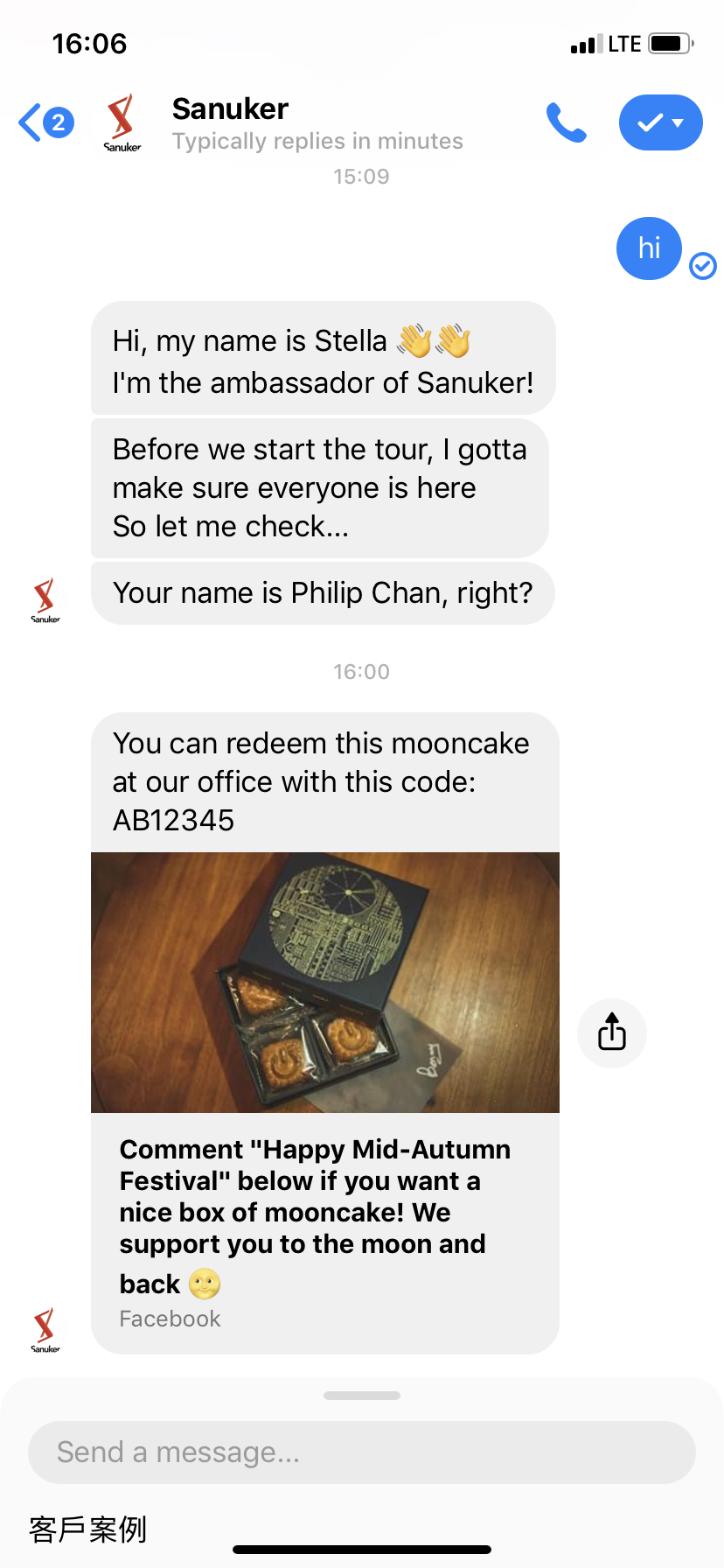
You may invest quite a lot of time to answer all the tricky inquiries on your Facebook posts since people nowadays expect a personal, sincere and instant reply from businesses at the moment they get in touch with those businesses. But how is this possible if your page is getting popular and all your posts are swamped with thousands of incoming questions at every second? This is made possible by public reply. This function is controlled by a chatbot which will send out an automatic reply once a user commented on a post. You can even make it more personal by inboxing a user directly. This follow up is called private reply.
Apart from acting as a "first responder", more and more Facebook pages smartly make use of this message template to create fun chatbot game. Public reply effectively boost page engagement and exposure while private reply is used as a means to activate a chatbot game.
Both public and private reply are limited to text only. However, once the users activate the chatbot in the Messenger inbox, chatbot will take over the conversation and start engaging users with more delicate UI, such as image, carousel, quick replies and etc.
Tips:
- To make the public reply text more personalised and interesting, you can try to add emojis 😉
A Public/Private Reply helps to handle people's expectation immediately.

